15

As you can see, the new design just went live!

At this point, we are done with major revisions to the design (although you can still report CSS/styling bugs by starting a new post and tagging it with and ). Thank you for your valuable design feedback and for your patience while we got this out for you.

We really hope you like the design!

1
  • 1
    Congrats for the new design!
    – walen
    Commented Apr 14, 2023 at 9:18

4 Answers 4

16

Thanks very much, the site looks great IMHO.
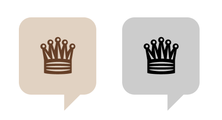
Just one little thing: while the favicons looked great on the feedback post...

enter image description here

... at their actual size they just look like a sand/grey box with a smaller, darker box inside:

enter image description here

(Sorry for the blurry capture, I had to resize the image for it to match the actual screen size in my 13" MacBook Pro -- but trust me, the favicons look almost exactly the same.)

The white-rook-on-blue-field favicon didn't have this problem: it was clear that the central figure was a rook.

Does anybody else experience this? And if so, can something be done about it?

10
  • I was wondering what this site is with a cooking pot icon... It seems to be the only icon that's an image inside a box, which makes the queen a fraction of the size it could've been. If the whole icon were a queen, it may look much better, but that image probably still has way too much detail for an icon. I'd probably have gone for a bishop or pawn, since those have very distinctive and simple shapes.
    – NotThatGuy
    Commented Apr 14, 2023 at 16:58
  • 1
    Yep, I noticed this issue and pointed it out internally as well. Thanks for pointing this out!
    – V2Blast StaffMod
    Commented Apr 14, 2023 at 17:24
  • 4
    Coming here from the sidebar HNQ list. As I'm not familiar with most chess players, I had no clue what this question was about before visiting it...
    – Andrew T.
    Commented Apr 18, 2023 at 2:55
  • @AndrewT. you ninja'd me ... I did know what the question would be about, but it was still hard to see whether it was posted on this site.
    – Glorfindel Mod
    Commented Apr 18, 2023 at 3:02
  • 1
    Yes, thanks for pointing this out! I agree, and I'll look at alternatives.
    – Chloe Staff
    Commented Apr 18, 2023 at 19:42
  • 2
    @Chloe dropping the speech balloon and enlarging the queen seems simplest to me - that's what happens with most sites, if you compare stackexchange.com/sites?view=list#questionsperday with their HNQ icons.
    – Glorfindel Mod
    Commented May 2, 2023 at 7:33
  • 2
    @Glorfindel yes, that's what I'm thinking too. I've had covid so have been slow on this, but my goal is to get this done next week!
    – Chloe Staff
    Commented May 4, 2023 at 14:20
  • 4
    Thanks for your patience everyone—this has been updated!
    – Chloe Staff
    Commented May 17, 2023 at 19:53
  • 3
    @Chloe thanks and great job! It's far better now :D
    – Andrew T.
    Commented May 18, 2023 at 4:03
  • Very late to the comment here, but a little sad the discussion we had on logo all those years ago went nowhere - chess.meta.stackexchange.com/questions/32/… Commented Dec 29, 2023 at 8:00
8

Thank you for the effort invested in engaging the community and implementing the new site design.

All the little details really come together very well.

4

Thank you all so very much. To many years more of chess galore! We shall see how everyone likes it. Strange for a sudden change, in a way, after so many years of silent blue.

1
-4

I am not personally a big fan. The site now feels very dark and crowded. But, I can see that everyone else likes it, so Ill drop that. Still excited that we have our logo and banner.

You must log in to answer this question.

Not the answer you're looking for? Browse other questions tagged .